BOOK A CONSULTATION

Emerge.me -Supplemental Health Insurance


Project Scope


Emerge.me is an online platform that provides insurance for medical emergencies in the USA. The aim of this project was to develop an easy to use optimal user experience that simplifies insurance to be used by everyone.

Role

Team: Millani Jayasingkam, Solmas Baibordi

My Role: UX Designer 

I worked as a UX designer tasked with redesigning the website as the current website did not have a good user experience. This started with UX research, content auditing, competitive analysis and strategy on information architecture followed by interaction wireframes and prototypes to testing and iteration.

Services

  • UX Research
  • Information Architecture
  • Prototyping
  • Testing
  • Iteration

Research

There were a number of techniques used to research this project.

Analytics

  • Age group for visitors: 25 to 34 (28%)
  • 62% Female, 38% Male
  • Device Category: 65% Mobile, 35% Desktop
  • Hotjar shows most activity above the fold on landing page

Interviews and Surveys

I started out by designing surveys and interviews for the users who have already visited the website and gone through the “Get Advice” section. I also surveyed and interviewed new users. The objective was to better understand their journey and pain points so I can address them in the redesign.

Key Findings — Survey and Interview Results

  • Users not comfortable providing personal information on website as it looks very generic
  • Hard to find more information about products
  • Max was mistaken for a live chat bot
  • Form felt lengthy and confusing
  • Not clear on all different ways of getting a quote
  • No context to video — most users missed the link to video
  • Irrelevant Hero images
  • No indication of supplemental insurance
  • Three sections for getting quotes but no product information
  • Website feels very sales heavy
  • Does not feel very trust worthy
  • Not sure about the Log in section

User Personas

Who is the user?
Based on the user research, I came up with a user persona.


User Journey Map

I wanted to get a better understanding of the user journey and their pain points.


Storyboard

The storyboarding phase helped me with better understanding the larger context that this app would operate within. I decided to focus on designing mobile first because 65% of the users are accessing this information through a mobile device.

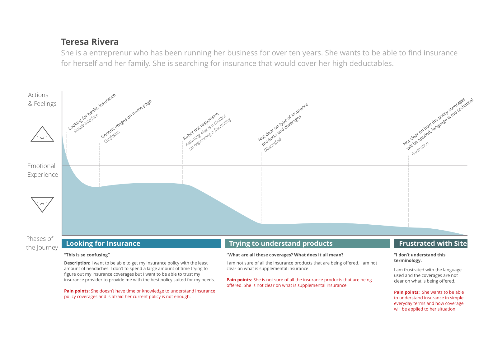
Drawing out the process of my user going through the website looking for a suitable insurance solution helped me realize how important it was to incorporate “production information” on and educate the user about supplemental insurance since that is the competitive advantage for Emerge.me.

User Stories

  • As a small business owner, I want to find a suitable policy that fits my needs so that I can purchase it.
  • As a concerned parent, I want to be covered entirely so that my family is protected.
  • Once I had the key components of my app thought out, I began drawing a user flow diagram to plan the user’s interaction and journey within the app.

Plan

Based on our research, I was able to determine the main pain points for our users. I used the research to define the problem.

Problem Statement

Users wants an easy to use platform where they can figure out the right product for their needs without having to understand the technical side of insurance.

User Flows

I wanted to understand the user flow so I mapped out user flows to figure out the flow for each user interaction.

Prototype

I created the wireframes to better understand the flow visually and to start testing initial designs. 


Test

I hypothesized that users will be able to navigate seamlessly through the new Emerge mobile website

Instructions

Imagine if you’re going to Emerge website as a new user. Go through the website and check out the following:
What are Emerge product offerings? How would you find a suitable policy for yourself?
How would you learn more about accidental insurance?

Results

  • Ask for an email early in the process to be able to re-market and send a quote
  • Ask for age instead of the date of birth
  • The navigation bar was changed from 5 to 3 items
  • Emerge Logo was linked to home
  • Tested and confirmed the hamburger menu
  • The menu was put back on the top right
  • Added more options on the menu
  • Replaced current video with image defining supplement insurance as video felt irrelevant

Based on user testing, I changed the iconography for users to make it more clear. I condensed all the navigation icons into a single bottom nav bar.

Iterate

In conclusion, we redesigned the landing page with the aim of ensuring that the user is able to easily understand Supplemental Insurance and find products offered by Emerge.me. We recommend using a natural language form to go through the quote and get advice section as it is more user friendly. We recommend adding all the products to landing page so it’s easier to find needed information and adding a video explaining coverages through a scenario in mini video format to the product information page. Services such as Videoscribe might be used to create these animations.

I HELP BUSINESSES BUILD A PROFITABLE ONLINE PRESENCE & TEACH DESIGNERS 

Download Portfolio Guide


Working with Rabeea was simple. She can clearly take the lead of a project. It’s apparent that she is confident in her skills and she validates those skills in her work. Rabeea has an understanding of putting humans at the center of design and helped me design a delightful experience for specific users.

If you are looking for someone that understands how to be thorough with research, planning, and design execution then you should be having a conversation with Rabeea.

Nicholas Peckham
Product Designer | Rokk3r Labs 

Employers and Clients

Have an idea?

Let’s talk about it

Canada 🇨🇦
250 Yonge Street, Suite 2201 
Toronto, Ontario Canada
M5B 2L7

United States 🇺🇸
99 Wall Street Suite1054
New York, NY, USA
10005

United Kingdom 🇬🇧
24 Holborn Viaduct,
London, United Kingdom
EC1A 2BN